
By: Allie Walters
Creative Director
#Brand, #Campaigns, #Design, #Marketing
January 27, 2020
In this blog, I’ll talk about colour trends for 2020, particularly useful if you’re setting up a new company or are looking to refresh your brand this year. So whether you’re looking for the trustworthiness of this years Pantone blue, the freshness of mint or the pizazz of 80’s neon, we hope this blog will inspire your new brand colours.
As we enter a new decade what better time is there to finally launch your startup or get stuck in to a rebranding project? Like fashion trends, branding advice for established businesses and startups alike is ever-changing but one thing remains the same: you need a winning branding colour palette. In fact colour is so important, much like the nations’ anticipation for the Premier League title race, every year designers eagerly anticipate the announcement of Pantone’s Colour of the Year.
Lucky for you, we’ve gathered 7 top brand design colour trends to help you create an ‘en vogue’ colour palette. Transform your brand’s look with the pizazz you need to grab your audience’s attention and let the world know you’re on top of your game.
Pantone’s Colour of the Year samples a classic, calming blue to soothe and promote a protective quality. Laurie Pressman, vice president of the Pantone Colour Institute, explained to The Independent newspaper why brands should consider the use of classic blue – the Colour of the Year – in 2020:
“The Pantone Colour of the Year highlights the relationship between trends in colour and what is taking place in our global culture at a moment in time, a colour that reflects what individuals feel they need that colour can hope to answer.”
“As society continues to recognise colour as a critical form of communication, and a way to express and affect ideas and emotions, designers and brands should feel inspired to use colour to engage and connect.”
Branding tip: calming is good, but you do need to insight passion and excitement too. To achieve the right balance combine blues with fresh and uplifting photography.
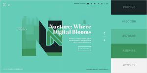
Before Pantone’s Colour of the Year was announced, experts predicted Neo Mint as 2020s answer to Millennial Pink. Fresh, futuristic and high-tech, the hue is reminiscent of the fragility of the environment, the warmth of spring that takes the chill off the cooler months, and is gender-neutral to boot.
Branding tip: pair mint tones with similar, complimenting hues to create the perfect brand identity colour palette for 2020.
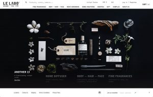
Get ahead of graphic design colour trends and achieve bold results with a black-and-white combo, which offers the maximum contrast possible. Monochromatic websites are classic, powerful, and they never go out of date – the combination being the epitome of sophistication.
Branding tip: If you go for the black and white look you do need to spend more time on perfecting typography, layouts and imagery to offset the lack of colour.
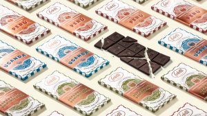
Is there anything more fitting than using rich golden hues and striking silver to exemplify luxury? In 2020 we’ll see designs pairing colour and texture, with polished metals a mainstay in the industry. Start off with an embossed gold feature on business cards, subtle rose gold or copper packaging. Premium Italian chocolatier, Feletti, oozes quality with their deluxe and decadent colour choices.
Branding tip: There can be too much gold, it should be reserved as an accent colour for edging and detail alongside pastel colours or white space as your predominant palette.

Stranger Things on Netflix has no doubt helped inspire this throwback neon trend. The good news is nothing quite catches the light like neon lettering and designs. In other words, injecting a little fluorescence into your company design can really help to rejuvenate your brand message. Whatever your business, a neon sign, logo or neon features will grab attention on your website. Here’s another idea, you could also create your own branded neon memes for your social channels? Whatever you create, neon will help you leave a vibrant and lasting impression.
Branding tip: This style is best suited to community or consumer brands that want to attract an audience with a penchant for nostalgia. You can find out more about setting your brand personas in our brand cafe.
<https://stuffandnonsense.co.uk/blog/redesigning-your-product-and-website-for-dark-mode” rel=”noopener noreferrer” target=”_blank”>Image from stuffandnonsense
Did you know that many consumers opt for dark mode preferences to lessen the amount their eyes strain to read a page? In addition, it’s also a helpful solution for people with dyslexia that struggle with glare white backgrounds. Inclusivity will be a key theme for 2020, which no doubt has had an influence on the rising trend of dark mode palettes. That said, white body text against a black background is tiring for the eye to read over a long period of time, so finding less harsh darker backgrounds that still match your brand’s colouring or logo is key.
Branding tip: Don’t be tempted to do a Missy Elliot and just ‘flip it and reverse it’. Creating dark mode designs takes a little more consideration than simply inverting the colours of your original design.
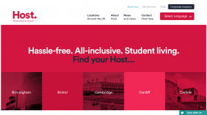
<https://host-students.com” rel=”noopener noreferrer” target=”_blank”>Image from Host-students
This layered trend might just be the biggest design shortcut of all time – and it’s effective to boot. For instance, pick any colour (perhaps even one of the other six included above), and use it as a focal point of your site, brand, flyers, posters or even album and book covers with a focused brand colour overlay. Suddenly, the puzzle of whether certain images work together on a page becomes non-existent – they all match. The effect is intriguing, creating unexpected visual effects that almost appear to hide something to be uncovered. And who doesn’t like a little mystery?
Branding tip: If you go for red make sure the chosen image doesn’t look like a crime drama headshot. Whatever colour you choose, you need an image with strong lines.
In conclusion, an overarching theme for 2020 is nostalgia. We begin to witness the decade that gave us the “Roaring Twenties” a century ago repeat itself with bold statements and subtle features often intertwined for effect. From lush deep blue hues and sophisticated metallics to playful neons and fresh mint tones, there’s something to match every brand. Choosing a fresh on-trend branding colour palette has the potential to position you one step ahead of established competitors, but also deliver the right message. Some say it’s crucial to pick a colour that works for your business, we say true… Above all, the most important thing to remember is that colour is meant to be fun. Enjoy it!
We’re into colour here at Brand Meadow. So much so, we’ve created Meadow, our design and content platform empowering growing businesses with the tools to design without being a designer. With Meadow, you can easily create day-to-day marketing tools whenever you need them, saving valuable time and money. Meadow is customisable to any brand; large or small. We cater to your colours, fonts, templates and work-flow.
Sign up for a free demo and give it a whirl!
Brand, Campaigns, Innovation, Marketing
7 tips for maintaining top notch brand consistency
Innovation
5 steps to becoming a (female) tech founder

Brand, Campaigns
Our fave charity brand 2017:
and 4 reasons why

Use our quick form and we'll be in touch shortly
Sign up below to get your freebie. Your email will never be shared with a third party.